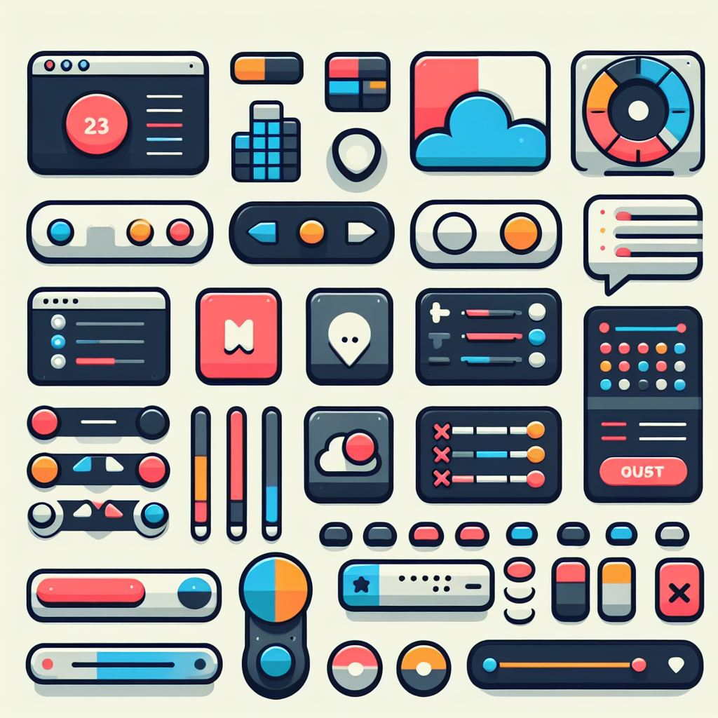
Basic UI terms that front-end developers should know
As a front-end developer, you should know the basic terms of UI. UI means the interface that interacts with users, and it consists of various elements. In this article, I will briefly explain the state of UI elements, GNB and LNB, main banner or hero banner, drop down list, modal and popup, snackbar and toggle, tooltip and input field, checkbox and accordion, breadcrumb.

State of UI elements
The state of UI elements refers to the change of UI elements according to the user's input. For example, a button is gray in normal state, but it changes to blue when clicked, and it looks blurry when disabled. The state of UI elements can have five state values: normal, active, inactive, focus, and selected.
GNB and LNB
GNB and LNB are elements that compose the navigation of the website. GNB stands for Global Navigation Bar, which is the main menu located at the top of the website. LNB stands for Local Navigation Bar, which is the sub-menu that appears when you click or mouse over the GNB menu.
Main banner or hero banner
Main banner or hero banner is a large banner located at the top of the website main. This area attracts the user's attention and delivers important content. Main banner or hero banner can include elements such as images, text, buttons, etc.
Drop down list
Drop down list is an element that allows you to select one of the detailed items that unfold when you click or hover over a button. Drop down list has the advantage of saving space and providing a range of choices to users.
Modal and popup
Modal and popup are elements that provide additional information or tasks to users. Modal is a function that covers a new layer over the page that was open, and popup is a concept of opening another browser page on the page. Modal and popup can increase the user's concentration and emphasize important content, but if abused, they can impair the user experience.
Snackbar and toggle
Snackbar and toggle are elements that show the results or settings of the actions performed by users. Snackbar is an element that shows the result of the action performed by the user in a simple text label form, and toggle is an element that can be applied to items such as setting on/off. Snackbar and toggle provide feedback and enhance interaction to users.
Tooltip and input field
Tooltip and input field are elements that help users. Tooltip is an explanation that appears when you bring the mouse over a specific screen element, and input field is an input box where users can enter and edit text. Tooltip and input field provide information and help input to users.
Checkbox and accordion
Checkbox and accordion are elements that handle multiple lists. Checkbox is a component that is used when you need to multi-select values from multiple lists, and accordion is a component that can expand and fold the content. Checkbox and accordion provide users with freedom of choice and visibility of content.
Breadcrumb
Breadcrumb is an information structure technique that is often used in PC web environments. Breadcrumb is a navigation that shows the current location in a visual hierarchy, including the location that the user has passed. Breadcrumb helps users to recognize their current location and easily return to the previous step.
Conclusion
So far, I have explained the basic UI terms that front-end developers should know. UI is a medium of communication between users and websites, so it is important to understand and use the meaning and function of UI elements well.